Design can be a tricky beast. Sometimes, things just go hilariously wrong. From signs that make zero sense to products that make you question humanity, we’ve got the ultimate collection of design disasters. Let’s laugh, cringe, and wonder together, “What were they thinking?” with these epic design fails!
1. Flickering Lights or Something Else?
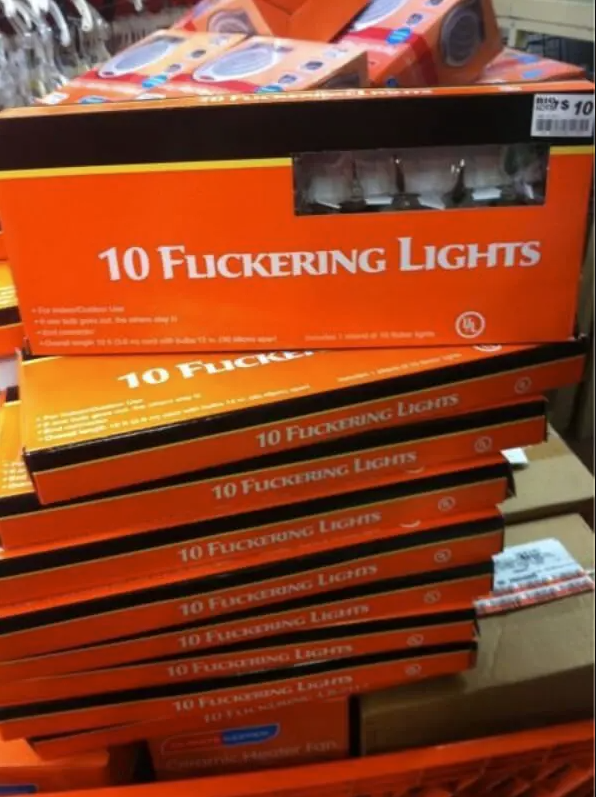
Looks like these Christmas lights were designed by the Grinch! For those tired of traditional holiday cheer, this packaging gives a whole new vibe. The font choice and letter spacing turn “Flickering Lights” into something that looks more like “10 F**kering Lights.” Not exactly the festive spirit they were aiming for. This famous design fail is a perfect reminder of the importance of font clarity. When your holiday decorations come with a side of confusion, it’s time to rethink the design. Let’s keep it merry and bright, not muddled and rude!
2. Where’s the Slide?
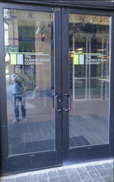
Welcome to “The Sliding Door Company,” where the doors don’t slide! These genius designers installed regular swinging doors right under a sign that screams “sliding.” Imagine the confusion as people tug and push, expecting a smooth glide. It’s like labeling a bicycle as a jet ski. Customers must feel duped every time they reach for those handles. It’s a door fail that leaves you wondering if the company’s name is a joke. Talk about false advertising!
3. The Fishy Spa Experience

Breathe. Relax. Get ready for a massage that transforms you into a human sushi roll! The woman in the photo looks like she’s wrapped up as a half-fried fish, ready to be served. This spa promises relaxation, but all I see is a confusing blend of spa day and dinner prep. It’s almost like they’re preparing you for a platter instead of pampering you. The marketing here is about as relaxing as being wrapped in seaweed. So, next time you’re in the mood for a massage, maybe skip the spa that doubles as a sushi bar!
4. Spidey’s Tissue Troubles
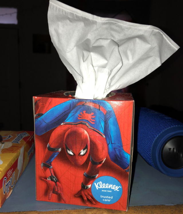
My spider-sense tells me this is wrong on so many levels. Kleenex had a golden opportunity to create a cool box for Spiderman fans. Instead, we get this hilariously unfortunate design fail. Poor Spidey looks like he’s struggling to get free from the tissues sprouting from his back. It’s almost as if our favorite web-slinger’s new job is to deliver tissues. Who knew fighting crime could lead to such paper problems? Kudos to Kleenex for giving us a laugh every time we need a tissue. This design is as sticky as Spidey’s webs!
5. Cinderella’s Puzzle Nightmare

We’ve all seen bad Disney ripoffs, but this puzzle takes the cake. The design itself is decent, but those puzzle cuts did Cinderella dirty. Her face looks like it was pieced together by someone who’d never seen her before. Bibbidy, bobbidy, botched! It’s as if the Fairy Godmother was out to lunch when they cut this one up. Poor Cinderella, she’s gone from princess to Picasso painting. This puzzle is a great reminder that sometimes, even the best designs can go terribly wrong with a few unfortunate cuts.
6. Minion Meltdown

Nothing says bath time fun like a Minion shampoo, right? Wrong! This strawberry-scented nightmare leaks red goo straight from the Minion’s eyes. It turns your cute Minion into a scene from a horror movie. Imagine reaching for your shampoo and seeing what looks like a Minion crying blood. It’s more terrifying than relaxing. This is one design fail that’s sure to leave kids screaming—and not in delight. Whoever thought red liquid was a good idea must have had a twisted sense of humor. Bath time just got a whole lot scarier!
7. McDonald’s Peekaboo Table

Check out this brilliant setup at McDonald’s. They’ve managed to turn a simple meal into a game of peekaboo. Apparently, someone thought it was a great idea to put a giant metal bar right at kid-eye level. Now, instead of enjoying their Happy Meals, kids get to stare at a piece of metal. Talk about a design fail! This might be McDonald’s way of adding a bit of mystery to your meal. Next time you’re at Mickey D’s, watch out for surprise obstacles. Eating should be simple, but clearly, it’s an adventure here!
8. The Boob-Handle Blunder

Oh, the irony of placing door handles right where this poor woman’s chest is! It’s so bad it feels intentional, like someone had a laugh at our expense. This design fail shows how a tiny detail can totally mess up the final look. Imagine walking up to this van and grabbing those handles—awkward! It’s a classic case of a good idea gone hilariously wrong. Designers, take note: placement matters. This is one advertisement that grabs attention for all the wrong reasons.
9. HDMI Headache

In it goes, I guess? This image triggers flashbacks of watching my parents try to insert a USB stick the wrong way—repeatedly. The struggle is real with this Virtual HDMI Dummy Adapter. It looks straightforward, but trust me, aligning it just right is an art. You’ll probably end up flipping it around a few times, questioning your life choices. Why is something so simple always so frustrating? Here’s to hoping you get it right on the first try, but let’s be real—it’s probably going to take a few attempts and a lot of patience.
10. Selfie Stick Fail
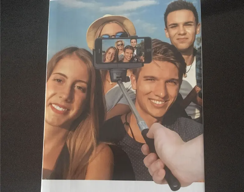
Here’s a classic case of marketing gone wrong. Someone clearly didn’t get the memo on how to use a selfie stick. Instead of the phone facing the group, it’s capturing the selfie stick in action. Brilliant, right? It’s like they designed this ad without ever seeing a selfie stick before. This is what happens when designers, marketers, and product developers don’t talk to each other. Next time, maybe they should try using the product before making the ad. For now, enjoy this gem of a design fail. It’s a lesson in the importance of doing your homework!
11. Specsavers Snafu
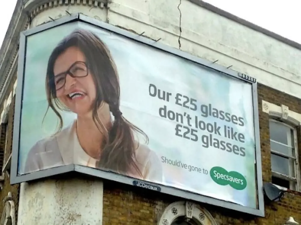
Specsavers proudly advertises their £25 glasses, but the poor placement has warped the model’s face into something out of a funhouse. It’s a real-life meme in the making. You can almost hear the collective “Oops!” from the marketing team. Even the best design and copy can crash and burn without proper placement. This is why you need someone who considers all the angles—literally. Next time, Specsavers might want to check the placement before proudly displaying their affordable eyewear. For now, enjoy the unintended comedy!
12. The Face Mask of Nightmares
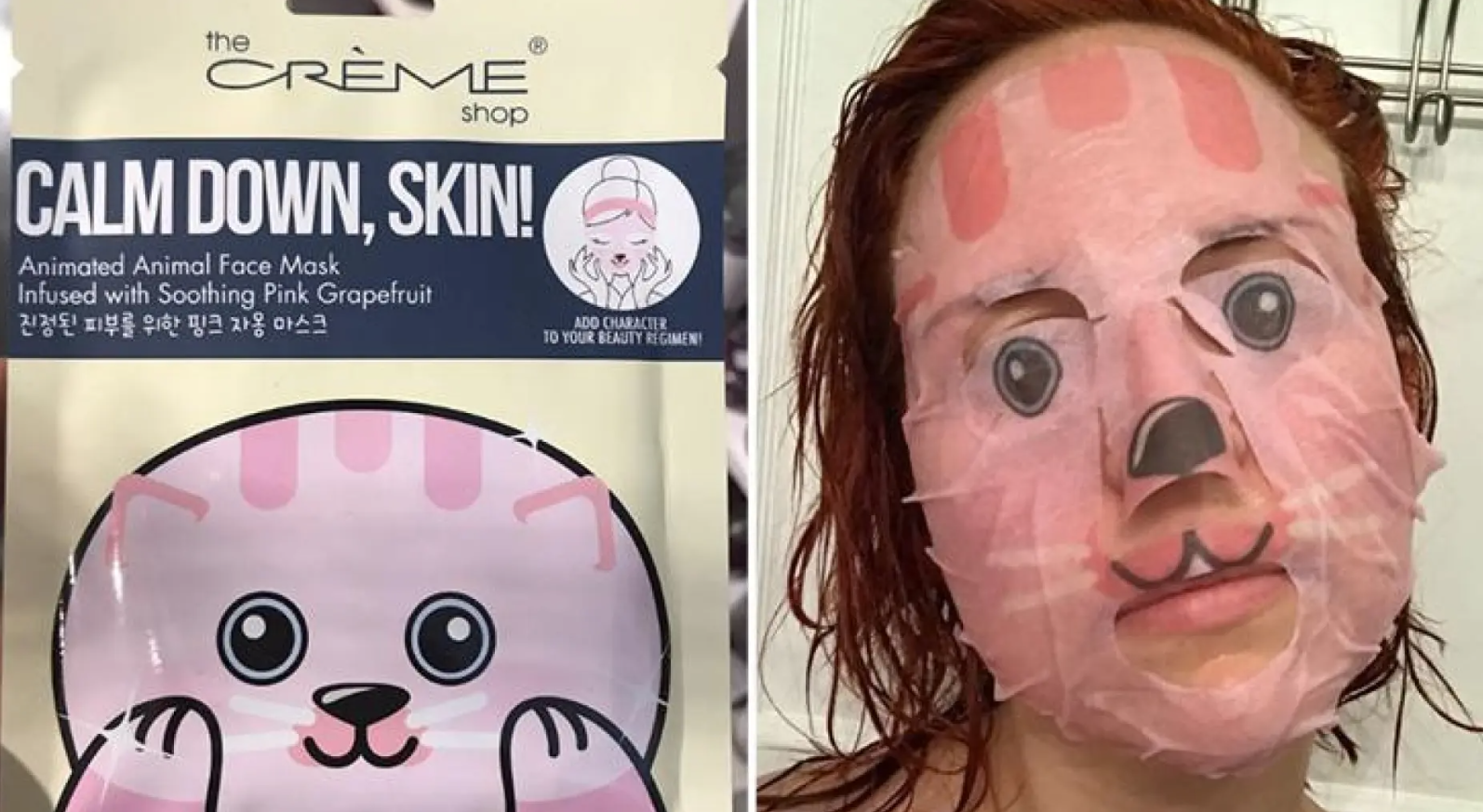
Just doing some hot girl stuff here with my soothing pink grapefruit mask. Or is it a horror movie audition? What was supposed to be a cute, calming mask looks more like something straight out of “Silence of the Lambs.” The packaging promised adorable animal vibes, but the result is terrifying. It’s a reminder that even the best packaging can hide some serious design fails. Instead of relaxing, you’ll be scaring yourself every time you look in the mirror. Calm down, skin? More like calm down, heart rate!
13. Diabetes Survey Disaster

Here’s a design fail that makes you feel like a sociopath. The question asks if you or someone you care for has diabetes. If you select “no,” you get a sad face. Seriously? Using emojis to convey answers is fine, but context is key. A frowning emoji for “no” makes it seem like you should be bummed about good health. It’s like getting punished for not having a medical condition. Talk about a confusing user experience! This survey needs a major overhaul, starting with those poorly chosen emojis.
14. Alphabet Puzzle Oops

What a cute “Jeopard”! This children’s alphabet puzzle has managed to turn a leopard into a game show. Proofreading might not be a designer’s job, but common sense and a basic grasp of the alphabet sure are. It’s almost like they created this in a hurry and thought, “Close enough.” Imagine teaching your kid the alphabet and stumbling upon this gem. “J is for… Jeopard?” This hilarious mix-up is a great reminder that even the simplest designs need a careful eye. A little proofreading goes a long way!
15. Pool Float or Giant Pad?

When social media is flooded with cute floats like flamingos and unicorns, dare to be different with this giant sanitary pad! Seriously, what were they thinking? I’m all for normalizing menstruation, but this pool float is just plain cringeworthy. It looks like someone thought, “Hey, let’s make a float that resembles a giant pad. That’ll be fun!” Spoiler alert: it’s not. If you want to make a splash at the pool, maybe go for something that doesn’t remind everyone of hygiene products.
16. Grease on the Go

I love a good thrift store find, but nothing says “brand shopping” like a bag that looks like it doubled as greasy takeout packaging. The North Face, you really nailed the eco-friendly vibe, but this bag screams, “I’ve been through the wringer.” It’s like someone thought, “Let’s add a touch of authenticity with a grease stain.” If you’re trying to impress with your eco-consciousness, maybe start with a bag that doesn’t look like it’s been recycled from last night’s dinner. This design is a total facepalm!
17. Noah’s Ark’s Fabulous Duo

Check out this Noah’s Ark illustration—two male lions, living their best life together. While it’s a fun twist, it also screams, “Pick your graphic designer wisely!” Someone clearly forgot about the whole “two of every kind” rule. Now we’ve got this fabulous pair strutting aboard the ark, making a statement. It’s a hilarious reminder of how a little oversight can turn a biblical tale into a comedy sketch. As much as we love these lions, it’s clear that even classic stories need a keen eye for detail.
18. The “Surprise! You’re Pregnant” Test
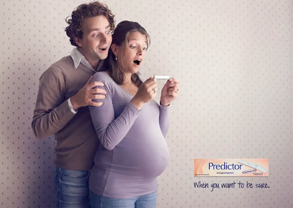
“Honey, I thought it was just holiday weight, but surprise—there’s a baby on the way!” This pregnancy test advert is so bad it’s almost endearing. But let’s be real, if you’re hoping to become a parent, this kind of unprofessional approach might make you look for a different product. The expectant mom is already very pregnant, making the test seem a bit redundant. It’s like advertising an umbrella in a rainstorm. This hilarious design fail highlights the importance of timing and relevance in advertising.
19. Coca-Cola’s Customization Catastrophe

This Coca-Cola customization fail is a textbook example of why you should double-check everything. Their platform blocked words like “Palestine,” “Transgender,” and “Black Lives Matter” but somehow missed the glaringly offensive “Nazis.” It’s a mix of bad filters and worse oversight. Imagine trying to make a heartfelt bottle only to be told it’s inappropriate while blatant hate speech slips through. This viral mishap shows the importance of thorough testing and common sense. Coca-Cola, maybe tweak those settings to avoid another fizzy fiasco!
20. The Switch That Stops Everything

This sign is a prime example of a fail-safe design gone wrong. “Please do not turn off the light switch. It also operates the elevator.” Seriously? Imagine the chaos every time someone misses this notice. One flick and the elevator’s out of order. It’s like playing a high-stakes game of light switch roulette. This design fail is both hilarious and frustrating. It makes you wonder how many people have been stuck because someone wanted to save electricity. Whoever wired this building needs a lesson in proper design!
21. The Remote Control Conundrum

Check out this remote—counting has never been so confusing! Instead of a 9, we’ve got a “page up” button. One of the cardinal rules of good design is to stick to familiar layouts. This remote decided to throw that rule out the window. Imagine trying to key in your favorite channel and ending up scrolling through pages instead. Frustration guaranteed! This is a perfect example of how a small design change can lead to a big headache. Whoever designed this remote needs a crash course in user-friendly design!
22. Stairway to Nowhere

If at first, you don’t succeed, just add some cones! These rails were likely installed to stop people from hitting their heads on the stairs. But now, it’s more likely someone will trip over them. The cones are a desperate, last-minute fix to an epic design fail. Imagine the confusion of navigating this obstacle course in an airport! This is a perfect example of how design mistakes can be costly and frustrating. It’s always a good idea to consider all angles before diving into the implementation stage.
23. Mr. Bean’s UX Design

This must be one of the worst UX design fails ever. Instead of a simple text box for your phone number, we’ve got a dropdown menu for each digit. Who thought this was a good idea? It’s as if Mr. Bean was hired to complicate things unnecessarily. Imagine the frustration of trying to enter your number this way. It’s a perfect example of overthinking a simple task and making it a nightmare for users. A big reminder that sometimes, less is more in design. This one’s a real head-scratcher!
24. The Wheelchair Slide

Talk about a wheelchair escape route gone wrong! This design imagined getting people out in an emergency, but didn’t think through the end of the journey. Instead of a safe exit, wheelchair users get an extreme sport. It’s like someone thought, “Let’s combine accessibility with a thrill ride.” Navigating those stairs is already tricky, but that ramp looks like a slip ‘n slide of doom. This is a prime example of how not to design for accessibility. Safety first, folks—this design is more of a hazard than a help!
25. The Confused Bathroom Tool

Meet the bathroom tool that can’t decide what it wants to be—a plunger or a toilet brush. It’s like the designers thought, “Why not both?” But in reality, who wants to handle a used toilet brush attached to a plunger? The idea is as practical as a screen door on a submarine. It proves that the road to hell is paved with good intentions. This design fail is a perfect example of trying to do too much and ending up with a mess—literally! Stick to one function, folks.
26. Elevator Button Overload

Get me out of here! This elevator panel looks like a nightmare. Seriously, you had one job. How did a simple display end up so complicated? Duplicate numbers, missing buttons, and an overall chaotic layout make this elevator ride a puzzle. Imagine trying to find your floor in this mess. It’s enough to make anyone panic. If you’re in a hurry or just trying to avoid an elevator anxiety attack, this design fail is a real doozy. Someone needs to rethink this button bonanza and bring some order to the chaos!
27. Dangerous Double Take

Imagine your grandma grabbing a can of cooking spray, only to realize she’s about to season dinner with insect killer! This design fail highlights the importance of differentiating product packaging. The cans look nearly identical, and keeping the brand consistent is crucial, but not at the risk of safety. The consequences of mixing these up are terrifying. A little extra effort in design could prevent a kitchen disaster. It’s a perfect example of how a well-intentioned design can go horribly wrong when practicality is overlooked.
28. Sharing for One
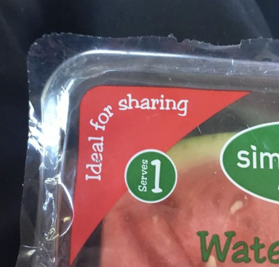
“Ideal for sharing” yet “serves 1″—make up your mind! This packaging sends mixed messages like no other. If you’re trying to plan your meals and count calories, this won’t help. It’s like the packaging is having an identity crisis. Reminds me of when my mom made me share everything with my siblings. No thanks, Mom! Next time, a little clarity would be nice. Is it for one or for sharing? Let’s not confuse the hungry customers! This is a classic example of poor design leading to a lot of head-scratching.
29. Bathroom Mirror Madness

Mirror ceilings are rarely a good idea, but this one takes the cake. Imagine the horror of walking into a bathroom stall and seeing everything reflected above you. It’s like the designers wanted to turn a private moment into a public spectacle. This design fail is both hilarious and terrifying. No one needs to see that much detail when they’re just trying to use the bathroom. It’s a perfect example of how a well-meaning design can go terribly wrong. Next time, let’s keep the mirrors away from the ceiling, okay?
30. Hand Dryer Heights

Hand dryers for mother and child! Try it out with a friend who’s shorter or taller than you for a laugh. The intention here might have been to cater to both adults and kids, but the execution is baffling. Who thought stacking hand dryers was a good idea? It looks like a vertical obstacle course. One dryer ends up being too high and the other too low for most people. While inclusivity in design is great, this setup is just plain awkward. Let’s stick to practical solutions that actually work for everyone.
31. Kindergarten Potty Party

Kids sure do live in tight-knit communities. Imagine putting down your sandwich to cheer on your friend doing a number two right next to you. This setup offers zero privacy, making bathroom time a social event. Who thought this was a good idea? It’s like an open-concept bathroom meets art class. While the intention might have been to keep an eye on the little ones, the execution is just plain awkward. Let’s give the kids some privacy, please. This design fail is more laughable than practical.
32. Shoes or Something Else?

This sign’s design fail is priceless. The unreadable “S” turns “Shoes are my life” into “Hoes are my life.” Seriously? Someone thought this was a great way to advertise shoes? The added lines about love and need only add to the hilarity and confusion. It’s hard to take a shoe store seriously when their sign makes you do a double-take and burst out laughing. This is a prime example of why clear fonts matter. Customers are here for shoes, not to ponder unexpected life choices!
33. Clickbait Gone Wrong

Here’s a classic design fail that turns “click lovers” into “dick lovers.” Who knew a single letter could cause such a mess? This sign is meant for a computer specialist shop, but it ends up sounding like something very different. While “click” might seem harmless on a small label, it becomes a problem on a massive sign. It’s a reminder that font choices and spacing matter. This sign likely gets more laughs than customers. Next time, let’s make sure our message is crystal clear and not unintentionally hilarious!